
Old Navy
As Freelance Creative Director at Old Navy, I led the creative for a new family of brand programs built to connect the brand with the culture its customers care about most: fashion, fandom, pop culture and the family moments worth celebrating. The ask was to create iconography that could carry a year of culturally relevant drops while still feeling like one recognizable Old Navy experience. I developed four programs, The Edit, The Fan Shop, The Culture Club and The Gift Shop, each anchored by an ownable object (a pen, a foam finger, a popcorn bucket, a wrapped gift) and built out into badge, horizontal and stacked lockups with its own color story grounded in Old Navy navy. From there I took the system into the store as sculptural destinations and photo moments, and onto the site as homepage and category modules, giving the brand a flexible home for licensed collaborations, seasonal gifting and entertainment moments.
The Challenge
Old Navy wanted to mean more to its customers, not just be seen by more of them. The brand already had the product and the reach. What it needed was a way to show up for the things people actually love, on a monthly and quarterly rhythm, across site, store, email and social, without reinventing the look every time.
The Edit for fashion. A styling-led edit of trend-right women's product, with a social-first voice.
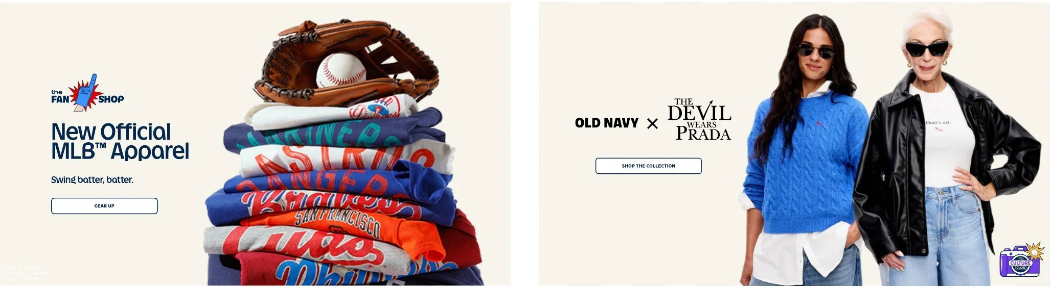
The Fan Shop for fandom. From pro to little league, a home for licensed sports and team pride.
The Culture Club for pop culture and entertainment. Film, music and the moments everyone is talking about.
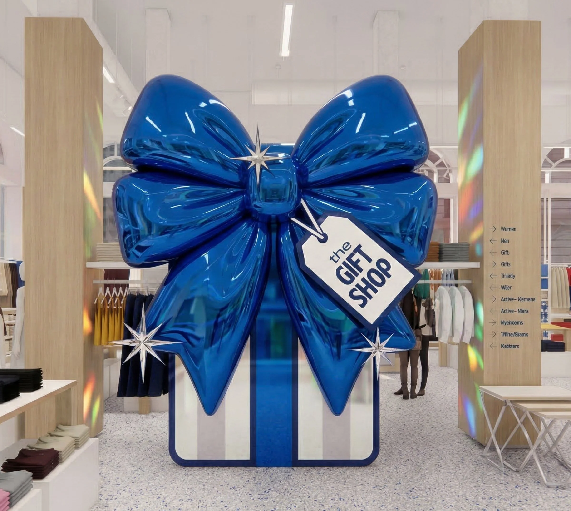
he Gift Shop for moments and milestones. Gift guides and matching looks for the whole family.
The system
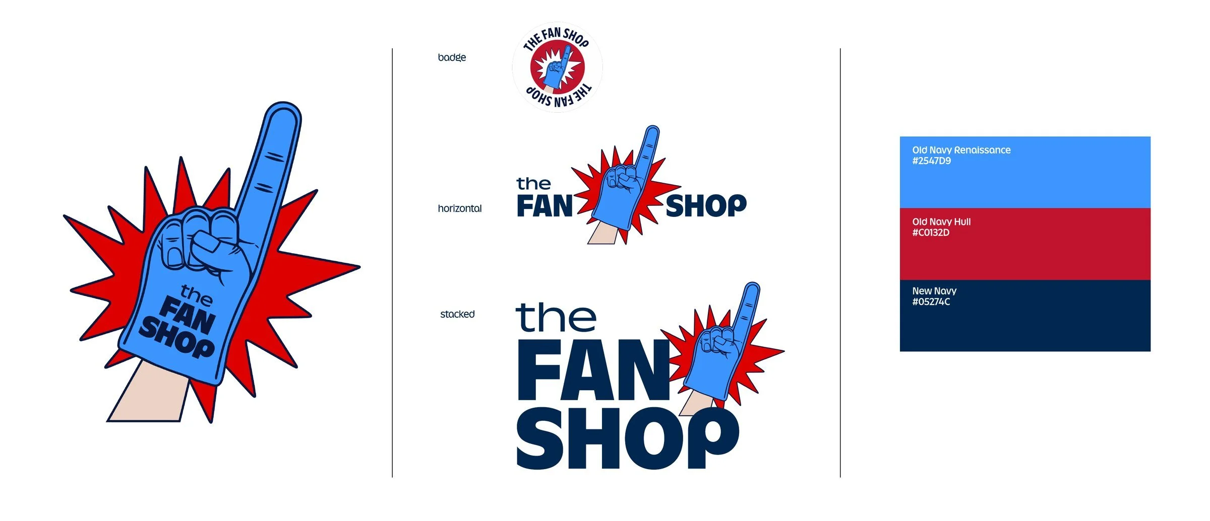
Every mark is built around a single object that says the program in one glance. They share one illustrative language, a confident navy keyline, flat saturated color and a little shine, so they read as siblings while each keeps its own attitude. Each program has a badge, horizontal and stacked lockup and a three-color palette anchored in New Navy, which let the marks flex from a small sticker on a product tile to a full homepage takeover.
In store
The marks were designed to scale. In the retail concepts, each one becomes a sculptural destination: a giant pen signing The Edit across the floor, a foam finger rising over the active zone, a camera-shaped photo booth for The Culture Club and a glossy wrapped gift at the heart of The Gift Shop. Each is an evergreen fixture that stays put while the product inside refreshes.
The idea
Culture I care about. We organized everything around four cultural territories and gave each one a program with its own name, mark and personality:
The Culture Club
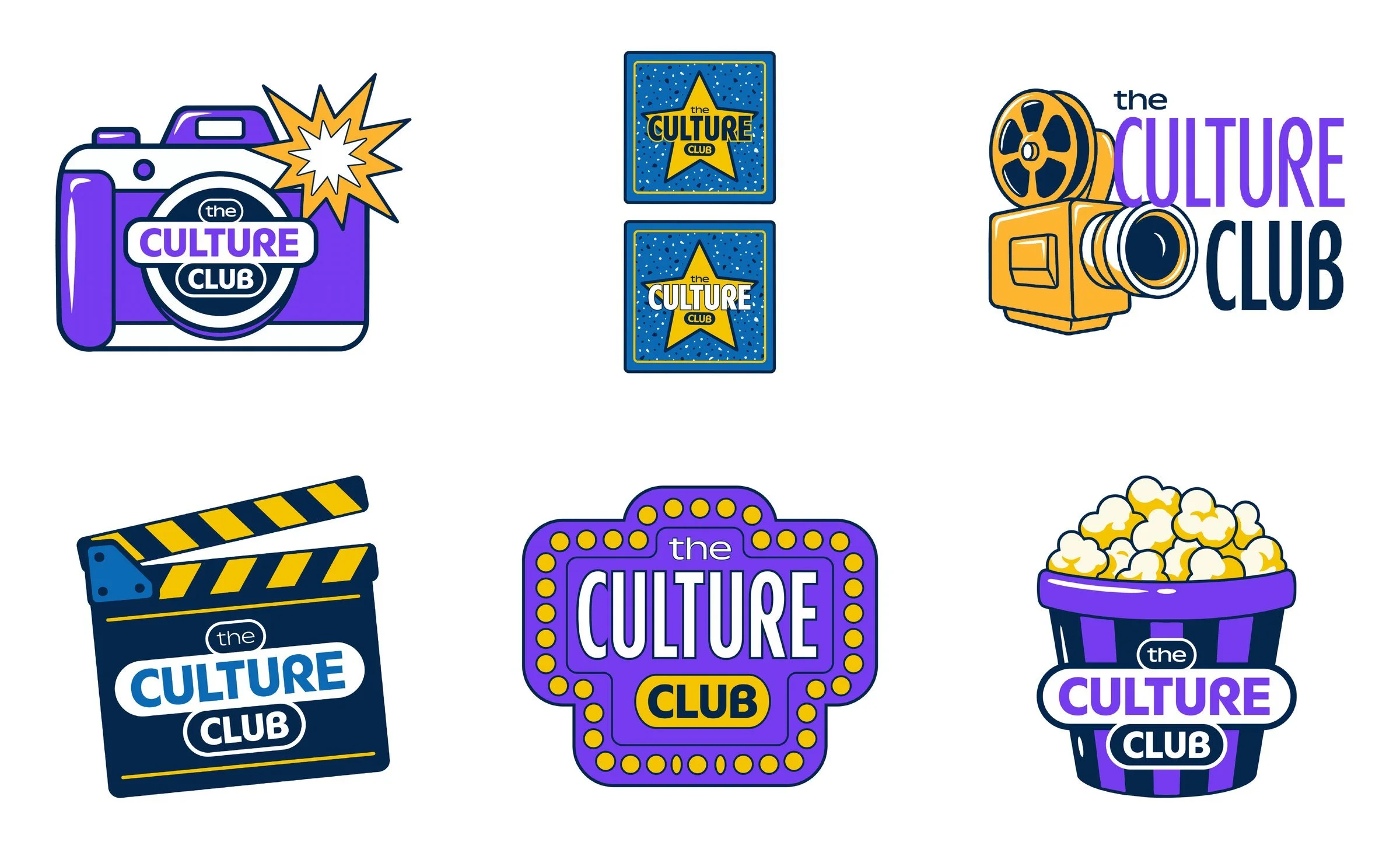
The Culture Club needed the most room to move, since it had to host everything from a movie release to a music moment. I explored six routes (a camera, a star badge, a film projector, a clapperboard, a theater marquee and a popcorn bucket) before landing on the popcorn bucket, the most universal symbol of settling in for something you love.
Online
On the site, the marks work as a lightweight badge system. They sit on homepage heroes and category cards to tell customers which world they are shopping in, whether that is new MLB apparel, a film collaboration or Father's Day.